
Understanding the data · 4 min read
What crime statistics really tell you — and what they don’t
Whether you’re moving suburbs or just curious about where you live, you’ll eventually meet a crime statistic — a number, a rate, a chart trending up or down. It’s worth knowing what those figures actually tell you, because read carelessly they can make a perfectly ordinary street feel alarming. Read well, the same figures are genuinely useful. The difference is a handful of habits, and none of them require a statistics degree.
Where the numbers come from
Most Australian crime figures you’ll encounter come from one of two places: each state or territory’s crime statistics agency (which publishes recorded offences from police data), or the Australian Bureau of Statistics (which pulls national pictures together). They’re careful, official, and useful — but they measure a specific thing: incidents that made it into the record. Keeping that in mind is the whole game, because almost every way people scare themselves with crime data comes from forgetting what the number is actually counting.
Recorded ≠ what happened
Official statistics count incidents that were recorded — usually reported to and logged by police. That’s not the same as everything that happened. Reporting rates vary a lot by offence type: a stolen car is almost always reported (insurance requires it); an attempted break-in that failed, or a bit of letterbox vandalism, often isn’t. So the recorded number is a floor, not a full picture — and the size of the gap between “recorded” and “actual” is different for every category.
This cuts the other way too, in a way that surprises people. Imagine two similar streets. On one, neighbours report the small stuff — the tampered car door, the stranger trying handles — and on the other they shrug it off. On paper the first street looks “worse” because its recorded number is higher, when really it’s just better at reporting. Higher engagement, not more crime.
Rates matter more than totals
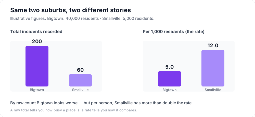
A big suburb will have more incidents than a small one simply because more people live there. That’s why a rate — incidents per head of population — is far more useful for comparing areas than a raw count. A raw total tells you how busy a place is; a rate tells you how it compares.
Here’s the idea with round numbers. Say Bigtown has 40,000 residents and 200 recorded incidents in a year, while Smallville has 5,000 residents and 60 incidents. By raw count Bigtown looks far worse — 200 versus 60. But per 1,000 residents, Bigtown sits at 5.0 and Smallville at 12.0. Once you account for how many people live there, Smallville actually has more than double the rate. Same two places, opposite conclusion — depending on which number you read.
Small numbers are noisy
In a small suburb, the raw counts are often tiny — and tiny numbers jump around for reasons that have nothing to do with safety. If a quiet area recorded 4 break-ins one year and 8 the next, a headline can honestly say break-ins “doubled” — a 100% rise! — when in truth four extra events across a whole year is well within normal fluctuation. The percentage sounds dramatic precisely because the base is small. Whenever you see a big percentage change, check the underlying counts before you react to it.
Trends need context
- One quarter’s spike is often noise — look at longer trends over several years, not a single jumpy period.
- A change in how police record or classify an offence can move a number without anything changing on the ground.
- Categories differ between states, so cross-border comparisons need care.
- Where an incident clusters matters — a hotspot around a transport hub or nightlife strip is not the same as the quiet residential street you’re considering.
How to read your suburb in five minutes
Put together, a calm reading is really just a short checklist you can run on any area:
- Use the rate (per head of population), not the raw total, to compare places.
- Look at the mix of offence types, not just one big number — property, personal, and public-order offences tell very different stories.
- Check the trend over three-plus years, and sanity-check any dramatic percentage against the actual counts.
- Notice where incidents cluster within the area before you assume they’re on your prospective doorstep.
Reading your area calmly
The healthy way to use this data is as context, not a verdict. It helps you understand the shape of an area — which is exactly why Pryer shows official recorded-incident context, framed as what it is: a record, never a danger rating. You can explore the recorded context for a suburb yourself, or read what recorded incidents do and don’t mean. Numbers are for understanding, not for fear.
And remember what no statistic can tell you: whether you’ll feel at home on a street, whether neighbours look out for each other, how a place feels on a weekday evening. Those come from visiting, walking around, and talking to people who live there. The data is a useful first filter and a good myth-buster — it just isn’t the whole story, and it was never meant to be.
How Pryer keeps the data calm
Pryer puts official recorded-incident context right on the map for your area — presented honestly as a record, never a scare-rating — so you can get a genuine feel for a place instead of reacting to a scary headline number. Explore your area to see it.
It’s the calm way to read a neighbourhood: real data plus what neighbours are actually reporting, without the fear feed. Understanding, not alarm.
Understand crime near your home better →